Showing posts with label Blog Design. Show all posts

How to Increase Thumbnail Resolution on Blogger

Posted On // Leave a Comment
When we add a widget on Blogger, the thumbnails will keep a default size of 72 x 72px which might not look good if we try to make them bigger using only CSS. However, with a bit of JavaScript we'll be able to replace the thumbnail with the same image of higher resolution and this way, larger images will no longer appear blurry.

In this tutorial we will see how we can replace the default thumbnail size of the popular posts widget but we can apply this trick on any of the blog widgets.

See a demo HERE.

Changing the Thumbnail Size for the Popular Posts Widget


Step 1. First, let's add the Popular posts gadget by going to Layout > click on the Add a gadget link and select Popular Posts from the popup window.

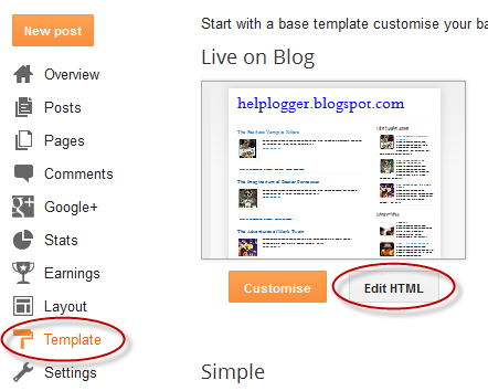
Step 2. Go to Template > click on the Edit HTML button > click anywhere inside the code area and press CTRL + F keys to open the Blogger search box

Step 3. Type or paste the </head> tag inside the search box then hit Enter to find it. After you found the </head> tag, add this CSS above it:
<style type='text/css'>
.PopularPosts .item-thumbnail a {
clip: auto;
display: block;
height: 130px;
margin: 0 0px 5px;
overflow: hidden;
width: 210px;
border: 2px solid #EEEEEE;
border-radius: 20px;
}
.PopularPosts .item-thumbnail img {
position: relative;
top: -30px;
transition:all .2s linear;
 -o-transition:all .5s linear;
-moz-transition:all .2s linear;
-webkit-transition:all .2s linear;
}
.PopularPosts .item-thumbnail img:hover{
opacity:.6;
filter:alpha(opacity=60)
}
.PopularPosts .widget-content ul li {
background: #F9F9F9;
border: 2px solid #EEEEEE;
border-radius: 10px;
box-shadow: 0 4px 10px #EEEEEE;
color: #555555;
padding: 10px;
margin-bottom: 5px;
}
.PopularPosts .item-title {
font: 14px Cambria,Georgia, sans-serif;
color: #2288BB;
font-weight: bold;
text-transform: uppercase;
text-align: center;
}
.PopularPosts .item-snippet {
display: none;
}
.widget .widget-item-control a img {
height: 18px;
width: 18px;
}
</style>
Step 4. Search for the </body> tag and just above it, add this script:
<script type='text/javascript'>                  
function changeThumbSize(id,size){
var blogGadget = document.getElementById(id);
var replacement = blogGadget.innerHTML;
blogGadget.innerHTML = replacement.replace(/s72-c/g,"s"+size+"-c");
var thumbnails = blogGadget.getElementsByTagName("img");
for(var i=0;i&lt;thumbnails.length;i++){
thumbnails[i].width = size;
thumbnails[i].height = size;
}
}
changeThumbSize("PopularPosts1",210);                  
</script>
What I highlighted in red is the widget ID for the Popular Posts gadget - to change the thumbnails size for any of your blog widgets, first you need to find the gadget/widge ID and then add a line below this part:
changeThumbSize("PopularPosts1",210);
changeThumbSize("widget-ID-HERE",210);
 ... and replace widget-ID-HERE text with the ID of that widget/gadget.

Note: you'll not be able to see the changes if the widget has a class selector - for this you will need to change class with id and replace the dot "." symbol with "#" within the CSS...

Step 5. Finally, Save the Template. 

If you need more help, please leave a comment below.
[Read more]

Create a CSS3 Image Hover Effect with Animated Vinyl Record

Posted On // Leave a Comment
Here is an amazing CSS image effect to reveal more information on your images with a really cool CSS3 hover animation. This is just perfect for blogs dedicated to music or if you just want to show off the music that you love.

So, what we will do in this tutorial is to take an image for our album cover, add some fancy CSS3 transitions and transforms that, on hover, will slide out a pure-CSS vinyl record behind it. Finally, we will add some basic HTML to our post or page where we need to apply this amazing effect.

Demo: hover over the album cover and see how CSS reveals further information:

The Wall is the eleventh studio album by the English progressive rock group Pink Floyd.

How to Apply The Animated Vinyl Record on Blogger Images


Step 1. From your Blogger's Dashboard, go to Template > click on the Edit HTML button:


Step 2. Click anywhere inside the code area and press the CTRL + F keys to open the search box:
Step 3. Type or paste inside the search box the tag below and hit Enter to find it:
]]></b:skin>
Step 4. Just above ]]></b:skin> add the following code:


.info {
position: absolute;
z-index: 3;
top: 20%;
zoom: 1;
filter: alpha(opacity=0);
opacity: 0;
padding: 10px;
text-align: center;
color: #eee;
font-size: 13px;
font-weight: bold;
background: #333;
background: rgba(0,0,0,.7);
-moz-transition:all linear 0.5s 0s;
-webkit-transition:all linear 0.5s 0s;
transition:all ease 0.5s 0s;
}
.case:hover .info, .case:hover .vinyl {
filter: alpha(opacity=100);
opacity:1;
}
.case {
position:relative;
display:block;
width:185px;
height:185px;
-webkit-border-radius:3px;
border-radius:3px;
z-index:2;
-webkit-box-shadow: 0px 0px 2px 0px rgba(0, 0, 0, 0.2);
box-shadow: 0px 0px 2px 0px rgba(0, 0, 0, 0.2);
margin:0 auto;
}
.case:after {
position:absolute;
display:block;
content: "";
width:265px;
height:10px;
left:-40px;
bottom:-8px;
z-index:1;
background: -moz-radial-gradient(center, ellipse cover,  rgba(0,0,0,0.45) 0%, rgba(0,0,0,0) 50%, rgba(225,225,225,0) 51%, rgba(246,246,246,0) 100%);
    background: -webkit-gradient(radial, center center, 0px, center center, 100%, color-stop(0%,rgba(0,0,0,0.45)), color-stop(50%,rgba(0,0,0,0)), color-stop(51%,rgba(225,225,225,0)), color-stop(100%,rgba(246,246,246,0)));
    background: -webkit-radial-gradient(center, ellipse cover,  rgba(0,0,0,0.45) 0%,rgba(0,0,0,0) 50%,rgba(225,225,225,0) 51%,rgba(246,246,246,0) 100%);
    background: -o-radial-gradient(center, ellipse cover,  rgba(0,0,0,0.45) 0%,rgba(0,0,0,0) 50%,rgba(225,225,225,0) 51%,rgba(246,246,246,0) 100%);
    background: -ms-radial-gradient(center, ellipse cover,  rgba(0,0,0,0.45) 0%,rgba(0,0,0,0) 50%,rgba(225,225,225,0) 51%,rgba(246,246,246,0) 100%);
    background: radial-gradient(center, ellipse cover,  rgba(0,0,0,0.45) 0%,rgba(0,0,0,0) 50%,rgba(225,225,225,0) 51%,rgba(246,246,246,0) 100%);
}
.case .cover{
position:absolute;
top:0;
left:0;
width:100%;
height:100%;
z-index:2;
-webkit-border-radius:3px;
border-radius:3px;
-webkit-box-shadow: 2px 0px 2px 0px rgba(0, 0, 0, 0.6);
box-shadow: 2px 0px 2px 0px rgba(0, 0, 0, 0.6);
}
.case .overlay{
position:absolute;
display:block;
top:0;
left:0;
z-index:3;
width:100%;
height:100%;
-webkit-box-shadow: inset 1px 1px 4px 0px rgba(255, 255, 255, 0.45),inset 1px 1px 2px 0px rgba(255,255, 255, 0.5),inset -1px -1px 2px 0px rgba(255,255, 255, 0.5);
    box-shadow: inset 1px 1px 4px 0px rgba(255,255, 255, 0.45),inset 1px 1px 2px 0px rgba(255,255, 255, 0.5),inset -1px -1px 2px 0px rgba(255,255, 255, 0.5);
-webkit-border-radius:3px;
border-radius:3px;
border:1px solid rgba(0, 0, 0, 0.35);
}
.case .overlay:before{
    position:absolute;
    display:block;
    content: "";
    top:0;
    left:0;
    z-index:4;
    width:100%;
    height:100%;
    background: -moz-linear-gradient(-55deg,  rgba(255,255,255,0.1) 0%, rgba(244,244,244,0.35) 50%, rgba(225,225,225,0) 51%, rgba(246,246,246,0) 100%); /* FF3.6+ */
    background: -webkit-gradient(linear, left top, right bottom, color-stop(0%,rgba(255,255,255,0.1)), color-stop(50%,rgba(244,244,244,0.35)), color-stop(51%,rgba(225,225,225,0)), color-stop(100%,rgba(246,246,246,0))); /* Chrome,Safari4+ */
    background: -webkit-linear-gradient(-45deg,  rgba(255,255,255,0.1) 0%,rgba(244,244,244,0.35) 50%,rgba(225,225,225,0) 51%,rgba(246,246,246,0) 100%); /* Chrome10+,Safari5.1+ */
    background: -o-linear-gradient(-45deg,  rgba(255,255,255,0.1) 0%,rgba(244,244,244,0.35) 50%,rgba(225,225,225,0) 51%,rgba(246,246,246,0) 100%); /* Opera 11.10+ */
    background: -ms-linear-gradient(-45deg,  rgba(255,255,255,0.1) 0%,rgba(244,244,244,0.35) 50%,rgba(225,225,225,0) 51%,rgba(246,246,246,0) 100%); /* IE10+ */
    background: linear-gradient(-55deg,  rgba(255,255,255,0.1) 0%,rgba(244,244,244,0.35) 50%,rgba(225,225,225,0) 51%,rgba(246,246,246,0) 100%); /* W3C */
    -webkit-border-radius:3px;
    border-radius:3px;
}
.vinyl {
    position:absolute;
    z-index:1;
    bottom:4px;
    left:5px;
    display:block;
    width:175px;
    height:175px;
    border-radius:200px;
    background: -moz-linear-gradient(top,  rgba(45,45,45,1) 0%, rgba(0,0,0,1) 100%);
    background: -webkit-gradient(linear, left top, left bottom, color-stop(0%,rgba(45,45,45,1)), color-stop(100%,rgba(0,0,0,1)));
    background: -webkit-linear-gradient(top,  rgba(45,45,45,1) 0%,rgba(0,0,0,1) 100%);
    background: -o-linear-gradient(top,  rgba(45,45,45,1) 0%,rgba(0,0,0,1) 100%);
    background: -ms-linear-gradient(top,  rgba(45,45,45,1) 0%,rgba(0,0,0,1) 100%);
    background: linear-gradient(top,  rgba(45,45,45,1) 0%,rgba(0,0,0,1) 100%);
    -webkit-box-shadow: inset 0px 1px 3px 0px rgba(255, 255, 255, 1);
    box-shadow: inset 0px 1px 0px 0px rgba(255, 255, 255, 0.35), inset 0px -1px 1px 0px rgba(255, 255, 255, 0.25), 0px 0px 8px 0px rgba(0, 0, 0, 0.4);
    border:1px solid #595959;
    transition: all 500ms ease-in-out;
    -moz-transition: all 500ms ease-in-out;
    -webkit-transition: all 500ms ease-in-out;
    -o-transition: all 500ms ease-in-out;
}
.case:hover .vinyl {
    animation: spin 600ms ease-in-out;
    -moz-animation: spin 600ms ease-in-out;
    -webkit-animation: spin 600ms ease-in-out;
    left:98px;
}
.vinyl:before {
    position:absolute;
    display:block;
    content: "";
    width:100%;
    height:100%;
    border-radius:100%;
    background: -moz-radial-gradient(center, ellipse cover,  rgba(38,38,38,0.4) 0%, rgba(89,89,89,0.4) 1%, rgba(35,35,35,0.4) 2%, rgba(86,86,86,0.4) 3%, rgba(35,35,35,0.4) 4%, rgba(86,86,86,0.4) 5%, rgba(35,35,35,0.4) 6%, rgba(86,86,86,0.4) 7%, rgba(35,35,35,0.4) 8%, rgba(86,86,86,0.4) 9%, rgba(35,35,35,0.4) 10%, rgba(86,86,86,0.4) 11%, rgba(35,35,35,0.4) 12%, rgba(86,86,86,0.4) 13%, rgba(35,35,35,0.4) 14%, rgba(86,86,86,0.4) 15%, rgba(35,35,35,0.4) 16%, rgba(86,86,86,0.4) 17%, rgba(35,35,35,0.4) 18%, rgba(86,86,86,0.4) 19%, rgba(35,35,35,0.4) 20%, rgba(86,86,86,0.4) 21%, rgba(35,35,35,0.4) 22%, rgba(86,86,86,0.4) 23%, rgba(35,35,35,0.4) 24%, rgba(86,86,86,0.4) 25%, rgba(35,35,35,0.4) 26%, rgba(86,86,86,0.4) 27%, rgba(35,35,35,0.4) 28%, rgba(86,86,86,0.4) 29%, rgba(35,35,35,0.4) 30%, rgba(86,86,86,0.4) 31%, rgba(35,35,35,0.4) 32%, rgba(86,86,86,0.4) 33%, rgba(35,35,35,0.4) 34%, rgba(86,86,86,0.4) 35%, rgba(35,35,35,0.4) 36%, rgba(86,86,86,0.4) 37%, rgba(35,35,35,0.4) 38%, rgba(86,86,86,0.4) 39%, rgba(35,35,35,0.4) 40%, rgba(86,86,86,0.4) 41%, rgba(35,35,35,0.4) 42%, rgba(86,86,86,0.4) 43%, rgba(35,35,35,0.4) 44%, rgba(86,86,86,0.4) 45%, rgba(35,35,35,0.4) 46%, rgba(86,86,86,0.4) 47%, rgba(35,35,35,0.4) 48%, rgba(86,86,86,0.4) 49%, rgba(35,35,35,0.4) 50%, rgba(86,86,86,0.4) 51%, rgba(35,35,35,0.4) 52%, rgba(86,86,86,0.4) 53%, rgba(35,35,35,0.4) 54%, rgba(86,86,86,0.4) 55%, rgba(35,35,35,0.4) 56%, rgba(86,86,86,0.4) 57%, rgba(35,35,35,0.4) 58%, rgba(86,86,86,0.4) 59%, rgba(35,35,35,0.4) 60%, rgba(86,86,86,0.4) 61%, rgba(35,35,35,0.4) 62%, rgba(86,86,86,0.4) 63%, rgba(35,35,35,0.4) 64%, rgba(86,86,86,0.4) 65%, rgba(35,35,35,0.4) 66%, rgba(86,86,86,0.4) 67%, rgba(35,35,35,0.4) 68%, rgba(86,86,86,0.4) 69%, rgba(35,35,35,0.4) 70%, rgba(86,86,86,0.4) 71%, rgba(35,35,35,0.4) 72%, rgba(86,86,86,0.4) 73%, rgba(35,35,35,0.4) 74%, rgba(86,86,86,0.4) 75%, rgba(35,35,35,0.4) 76%, rgba(86,86,86,0.4) 77%, rgba(35,35,35,0.4) 78%, rgba(86,86,86,0.4) 79%, rgba(35,35,35,0.4) 80%, rgba(86,86,86,0.4) 81%, rgba(35,35,35,0.4) 82%, rgba(86,86,86,0.4) 83%, rgba(35,35,35,0.4) 84%, rgba(86,86,86,0.4) 85%, rgba(35,35,35,0.4) 86%, rgba(86,86,86,0.4) 87%, rgba(35,35,35,0.4) 88%, rgba(86,86,86,0.4) 89%, rgba(35,35,35,0.4) 90%, rgba(86,86,86,0.4) 91%, rgba(35,35,35,0.4) 92%, rgba(86,86,86,0.4) 93%, rgba(35,35,35,0.4) 94%, rgba(86,86,86,0.4) 95%, rgba(35,35,35,0.4) 96%, rgba(86,86,86,0.4) 97%, rgba(86,86,86,0.4) 97%, rgba(35,35,35,0.4) 98%);
    background: -webkit-gradient(radial, center center, 0px, center center, 100%, color-stop(0%,rgba(38,38,38,0.4)), color-stop(1%,rgba(89,89,89,0.4)), color-stop(2%,rgba(35,35,35,0.4)), color-stop(3%,rgba(86,86,86,0.4)), color-stop(4%,rgba(35,35,35,0.4)), color-stop(5%,rgba(86,86,86,0.4)), color-stop(6%,rgba(35,35,35,0.4)), color-stop(7%,rgba(86,86,86,0.4)), color-stop(8%,rgba(35,35,35,0.4)), color-stop(9%,rgba(86,86,86,0.4)), color-stop(10%,rgba(35,35,35,0.4)), color-stop(11%,rgba(86,86,86,0.4)), color-stop(12%,rgba(35,35,35,0.4)), color-stop(13%,rgba(86,86,86,0.4)), color-stop(14%,rgba(35,35,35,0.4)), color-stop(15%,rgba(86,86,86,0.4)), color-stop(16%,rgba(35,35,35,0.4)), color-stop(17%,rgba(86,86,86,0.4)), color-stop(18%,rgba(35,35,35,0.4)), color-stop(19%,rgba(86,86,86,0.4)), color-stop(20%,rgba(35,35,35,0.4)), color-stop(21%,rgba(86,86,86,0.4)), color-stop(22%,rgba(35,35,35,0.4)), color-stop(23%,rgba(86,86,86,0.4)), color-stop(24%,rgba(35,35,35,0.4)), color-stop(25%,rgba(86,86,86,0.4)), color-stop(26%,rgba(35,35,35,0.4)), color-stop(27%,rgba(86,86,86,0.4)), color-stop(28%,rgba(35,35,35,0.4)), color-stop(29%,rgba(86,86,86,0.4)), color-stop(30%,rgba(35,35,35,0.4)), color-stop(31%,rgba(86,86,86,0.4)), color-stop(32%,rgba(35,35,35,0.4)), color-stop(33%,rgba(86,86,86,0.4)), color-stop(34%,rgba(35,35,35,0.4)), color-stop(35%,rgba(86,86,86,0.4)), color-stop(36%,rgba(35,35,35,0.4)), color-stop(37%,rgba(86,86,86,0.4)), color-stop(38%,rgba(35,35,35,0.4)), color-stop(39%,rgba(86,86,86,0.4)), color-stop(40%,rgba(35,35,35,0.4)), color-stop(41%,rgba(86,86,86,0.4)), color-stop(42%,rgba(35,35,35,0.4)), color-stop(43%,rgba(86,86,86,0.4)), color-stop(44%,rgba(35,35,35,0.4)), color-stop(45%,rgba(86,86,86,0.4)), color-stop(46%,rgba(35,35,35,0.4)), color-stop(47%,rgba(86,86,86,0.4)), color-stop(48%,rgba(35,35,35,0.4)), color-stop(49%,rgba(86,86,86,0.4)), color-stop(50%,rgba(35,35,35,0.4)), color-stop(51%,rgba(86,86,86,0.4)), color-stop(52%,rgba(35,35,35,0.4)), color-stop(53%,rgba(86,86,86,0.4)), color-stop(54%,rgba(35,35,35,0.4)), color-stop(55%,rgba(86,86,86,0.4)), color-stop(56%,rgba(35,35,35,0.4)), color-stop(57%,rgba(86,86,86,0.4)), color-stop(58%,rgba(35,35,35,0.4)), color-stop(59%,rgba(86,86,86,0.4)), color-stop(60%,rgba(35,35,35,0.4)), color-stop(61%,rgba(86,86,86,0.4)), color-stop(62%,rgba(35,35,35,0.4)), color-stop(63%,rgba(86,86,86,0.4)), color-stop(64%,rgba(35,35,35,0.4)), color-stop(65%,rgba(86,86,86,0.4)), color-stop(66%,rgba(35,35,35,0.4)), color-stop(67%,rgba(86,86,86,0.4)), color-stop(68%,rgba(35,35,35,0.4)), color-stop(69%,rgba(86,86,86,0.4)), color-stop(70%,rgba(35,35,35,0.4)), color-stop(71%,rgba(86,86,86,0.4)), color-stop(72%,rgba(35,35,35,0.4)), color-stop(73%,rgba(86,86,86,0.4)), color-stop(74%,rgba(35,35,35,0.4)), color-stop(75%,rgba(86,86,86,0.4)), color-stop(76%,rgba(35,35,35,0.4)), color-stop(77%,rgba(86,86,86,0.4)), color-stop(78%,rgba(35,35,35,0.4)), color-stop(79%,rgba(86,86,86,0.4)), color-stop(80%,rgba(35,35,35,0.4)), color-stop(81%,rgba(86,86,86,0.4)), color-stop(82%,rgba(35,35,35,0.4)), color-stop(83%,rgba(86,86,86,0.4)), color-stop(84%,rgba(35,35,35,0.4)), color-stop(85%,rgba(86,86,86,0.4)), color-stop(86%,rgba(35,35,35,0.4)), color-stop(87%,rgba(86,86,86,0.4)), color-stop(88%,rgba(35,35,35,0.4)), color-stop(89%,rgba(86,86,86,0.4)), color-stop(90%,rgba(35,35,35,0.4)), color-stop(91%,rgba(86,86,86,0.4)), color-stop(92%,rgba(35,35,35,0.4)), color-stop(93%,rgba(86,86,86,0.4)), color-stop(94%,rgba(35,35,35,0.4)), color-stop(95%,rgba(86,86,86,0.4)), color-stop(96%,rgba(35,35,35,0.4)), color-stop(97%,rgba(86,86,86,0.4)), color-stop(97%,rgba(86,86,86,0.4)), color-stop(98%,rgba(35,35,35,0.4)));
    background: -webkit-radial-gradient(center, ellipse cover,  rgba(38,38,38,0.4) 0%,rgba(89,89,89,0.4) 1%,rgba(35,35,35,0.4) 2%,rgba(86,86,86,0.4) 3%,rgba(35,35,35,0.4) 4%,rgba(86,86,86,0.4) 5%,rgba(35,35,35,0.4) 6%,rgba(86,86,86,0.4) 7%,rgba(35,35,35,0.4) 8%,rgba(86,86,86,0.4) 9%,rgba(35,35,35,0.4) 10%,rgba(86,86,86,0.4) 11%,rgba(35,35,35,0.4) 12%,rgba(86,86,86,0.4) 13%,rgba(35,35,35,0.4) 14%,rgba(86,86,86,0.4) 15%,rgba(35,35,35,0.4) 16%,rgba(86,86,86,0.4) 17%,rgba(35,35,35,0.4) 18%,rgba(86,86,86,0.4) 19%,rgba(35,35,35,0.4) 20%,rgba(86,86,86,0.4) 21%,rgba(35,35,35,0.4) 22%,rgba(86,86,86,0.4) 23%,rgba(35,35,35,0.4) 24%,rgba(86,86,86,0.4) 25%,rgba(35,35,35,0.4) 26%,rgba(86,86,86,0.4) 27%,rgba(35,35,35,0.4) 28%,rgba(86,86,86,0.4) 29%,rgba(35,35,35,0.4) 30%,rgba(86,86,86,0.4) 31%,rgba(35,35,35,0.4) 32%,rgba(86,86,86,0.4) 33%,rgba(35,35,35,0.4) 34%,rgba(86,86,86,0.4) 35%,rgba(35,35,35,0.4) 36%,rgba(86,86,86,0.4) 37%,rgba(35,35,35,0.4) 38%,rgba(86,86,86,0.4) 39%,rgba(35,35,35,0.4) 40%,rgba(86,86,86,0.4) 41%,rgba(35,35,35,0.4) 42%,rgba(86,86,86,0.4) 43%,rgba(35,35,35,0.4) 44%,rgba(86,86,86,0.4) 45%,rgba(35,35,35,0.4) 46%,rgba(86,86,86,0.4) 47%,rgba(35,35,35,0.4) 48%,rgba(86,86,86,0.4) 49%,rgba(35,35,35,0.4) 50%,rgba(86,86,86,0.4) 51%,rgba(35,35,35,0.4) 52%,rgba(86,86,86,0.4) 53%,rgba(35,35,35,0.4) 54%,rgba(86,86,86,0.4) 55%,rgba(35,35,35,0.4) 56%,rgba(86,86,86,0.4) 57%,rgba(35,35,35,0.4) 58%,rgba(86,86,86,0.4) 59%,rgba(35,35,35,0.4) 60%,rgba(86,86,86,0.4) 61%,rgba(35,35,35,0.4) 62%,rgba(86,86,86,0.4) 63%,rgba(35,35,35,0.4) 64%,rgba(86,86,86,0.4) 65%,rgba(35,35,35,0.4) 66%,rgba(86,86,86,0.4) 67%,rgba(35,35,35,0.4) 68%,rgba(86,86,86,0.4) 69%,rgba(35,35,35,0.4) 70%,rgba(86,86,86,0.4) 71%,rgba(35,35,35,0.4) 72%,rgba(86,86,86,0.4) 73%,rgba(35,35,35,0.4) 74%,rgba(86,86,86,0.4) 75%,rgba(35,35,35,0.4) 76%,rgba(86,86,86,0.4) 77%,rgba(35,35,35,0.4) 78%,rgba(86,86,86,0.4) 79%,rgba(35,35,35,0.4) 80%,rgba(86,86,86,0.4) 81%,rgba(35,35,35,0.4) 82%,rgba(86,86,86,0.4) 83%,rgba(35,35,35,0.4) 84%,rgba(86,86,86,0.4) 85%,rgba(35,35,35,0.4) 86%,rgba(86,86,86,0.4) 87%,rgba(35,35,35,0.4) 88%,rgba(86,86,86,0.4) 89%,rgba(35,35,35,0.4) 90%,rgba(86,86,86,0.4) 91%,rgba(35,35,35,0.4) 92%,rgba(86,86,86,0.4) 93%,rgba(35,35,35,0.4) 94%,rgba(86,86,86,0.4) 95%,rgba(35,35,35,0.4) 96%,rgba(86,86,86,0.4) 97%,rgba(86,86,86,0.4) 97%,rgba(35,35,35,0.4) 98%);
    background: -o-radial-gradient(center, ellipse cover,  rgba(38,38,38,0.4) 0%,rgba(89,89,89,0.4) 1%,rgba(35,35,35,0.4) 2%,rgba(86,86,86,0.4) 3%,rgba(35,35,35,0.4) 4%,rgba(86,86,86,0.4) 5%,rgba(35,35,35,0.4) 6%,rgba(86,86,86,0.4) 7%,rgba(35,35,35,0.4) 8%,rgba(86,86,86,0.4) 9%,rgba(35,35,35,0.4) 10%,rgba(86,86,86,0.4) 11%,rgba(35,35,35,0.4) 12%,rgba(86,86,86,0.4) 13%,rgba(35,35,35,0.4) 14%,rgba(86,86,86,0.4) 15%,rgba(35,35,35,0.4) 16%,rgba(86,86,86,0.4) 17%,rgba(35,35,35,0.4) 18%,rgba(86,86,86,0.4) 19%,rgba(35,35,35,0.4) 20%,rgba(86,86,86,0.4) 21%,rgba(35,35,35,0.4) 22%,rgba(86,86,86,0.4) 23%,rgba(35,35,35,0.4) 24%,rgba(86,86,86,0.4) 25%,rgba(35,35,35,0.4) 26%,rgba(86,86,86,0.4) 27%,rgba(35,35,35,0.4) 28%,rgba(86,86,86,0.4) 29%,rgba(35,35,35,0.4) 30%,rgba(86,86,86,0.4) 31%,rgba(35,35,35,0.4) 32%,rgba(86,86,86,0.4) 33%,rgba(35,35,35,0.4) 34%,rgba(86,86,86,0.4) 35%,rgba(35,35,35,0.4) 36%,rgba(86,86,86,0.4) 37%,rgba(35,35,35,0.4) 38%,rgba(86,86,86,0.4) 39%,rgba(35,35,35,0.4) 40%,rgba(86,86,86,0.4) 41%,rgba(35,35,35,0.4) 42%,rgba(86,86,86,0.4) 43%,rgba(35,35,35,0.4) 44%,rgba(86,86,86,0.4) 45%,rgba(35,35,35,0.4) 46%,rgba(86,86,86,0.4) 47%,rgba(35,35,35,0.4) 48%,rgba(86,86,86,0.4) 49%,rgba(35,35,35,0.4) 50%,rgba(86,86,86,0.4) 51%,rgba(35,35,35,0.4) 52%,rgba(86,86,86,0.4) 53%,rgba(35,35,35,0.4) 54%,rgba(86,86,86,0.4) 55%,rgba(35,35,35,0.4) 56%,rgba(86,86,86,0.4) 57%,rgba(35,35,35,0.4) 58%,rgba(86,86,86,0.4) 59%,rgba(35,35,35,0.4) 60%,rgba(86,86,86,0.4) 61%,rgba(35,35,35,0.4) 62%,rgba(86,86,86,0.4) 63%,rgba(35,35,35,0.4) 64%,rgba(86,86,86,0.4) 65%,rgba(35,35,35,0.4) 66%,rgba(86,86,86,0.4) 67%,rgba(35,35,35,0.4) 68%,rgba(86,86,86,0.4) 69%,rgba(35,35,35,0.4) 70%,rgba(86,86,86,0.4) 71%,rgba(35,35,35,0.4) 72%,rgba(86,86,86,0.4) 73%,rgba(35,35,35,0.4) 74%,rgba(86,86,86,0.4) 75%,rgba(35,35,35,0.4) 76%,rgba(86,86,86,0.4) 77%,rgba(35,35,35,0.4) 78%,rgba(86,86,86,0.4) 79%,rgba(35,35,35,0.4) 80%,rgba(86,86,86,0.4) 81%,rgba(35,35,35,0.4) 82%,rgba(86,86,86,0.4) 83%,rgba(35,35,35,0.4) 84%,rgba(86,86,86,0.4) 85%,rgba(35,35,35,0.4) 86%,rgba(86,86,86,0.4) 87%,rgba(35,35,35,0.4) 88%,rgba(86,86,86,0.4) 89%,rgba(35,35,35,0.4) 90%,rgba(86,86,86,0.4) 91%,rgba(35,35,35,0.4) 92%,rgba(86,86,86,0.4) 93%,rgba(35,35,35,0.4) 94%,rgba(86,86,86,0.4) 95%,rgba(35,35,35,0.4) 96%,rgba(86,86,86,0.4) 97%,rgba(86,86,86,0.4) 97%,rgba(35,35,35,0.4) 98%);
    background: -ms-radial-gradient(center, ellipse cover,  rgba(38,38,38,0.4) 0%,rgba(89,89,89,0.4) 1%,rgba(35,35,35,0.4) 2%,rgba(86,86,86,0.4) 3%,rgba(35,35,35,0.4) 4%,rgba(86,86,86,0.4) 5%,rgba(35,35,35,0.4) 6%,rgba(86,86,86,0.4) 7%,rgba(35,35,35,0.4) 8%,rgba(86,86,86,0.4) 9%,rgba(35,35,35,0.4) 10%,rgba(86,86,86,0.4) 11%,rgba(35,35,35,0.4) 12%,rgba(86,86,86,0.4) 13%,rgba(35,35,35,0.4) 14%,rgba(86,86,86,0.4) 15%,rgba(35,35,35,0.4) 16%,rgba(86,86,86,0.4) 17%,rgba(35,35,35,0.4) 18%,rgba(86,86,86,0.4) 19%,rgba(35,35,35,0.4) 20%,rgba(86,86,86,0.4) 21%,rgba(35,35,35,0.4) 22%,rgba(86,86,86,0.4) 23%,rgba(35,35,35,0.4) 24%,rgba(86,86,86,0.4) 25%,rgba(35,35,35,0.4) 26%,rgba(86,86,86,0.4) 27%,rgba(35,35,35,0.4) 28%,rgba(86,86,86,0.4) 29%,rgba(35,35,35,0.4) 30%,rgba(86,86,86,0.4) 31%,rgba(35,35,35,0.4) 32%,rgba(86,86,86,0.4) 33%,rgba(35,35,35,0.4) 34%,rgba(86,86,86,0.4) 35%,rgba(35,35,35,0.4) 36%,rgba(86,86,86,0.4) 37%,rgba(35,35,35,0.4) 38%,rgba(86,86,86,0.4) 39%,rgba(35,35,35,0.4) 40%,rgba(86,86,86,0.4) 41%,rgba(35,35,35,0.4) 42%,rgba(86,86,86,0.4) 43%,rgba(35,35,35,0.4) 44%,rgba(86,86,86,0.4) 45%,rgba(35,35,35,0.4) 46%,rgba(86,86,86,0.4) 47%,rgba(35,35,35,0.4) 48%,rgba(86,86,86,0.4) 49%,rgba(35,35,35,0.4) 50%,rgba(86,86,86,0.4) 51%,rgba(35,35,35,0.4) 52%,rgba(86,86,86,0.4) 53%,rgba(35,35,35,0.4) 54%,rgba(86,86,86,0.4) 55%,rgba(35,35,35,0.4) 56%,rgba(86,86,86,0.4) 57%,rgba(35,35,35,0.4) 58%,rgba(86,86,86,0.4) 59%,rgba(35,35,35,0.4) 60%,rgba(86,86,86,0.4) 61%,rgba(35,35,35,0.4) 62%,rgba(86,86,86,0.4) 63%,rgba(35,35,35,0.4) 64%,rgba(86,86,86,0.4) 65%,rgba(35,35,35,0.4) 66%,rgba(86,86,86,0.4) 67%,rgba(35,35,35,0.4) 68%,rgba(86,86,86,0.4) 69%,rgba(35,35,35,0.4) 70%,rgba(86,86,86,0.4) 71%,rgba(35,35,35,0.4) 72%,rgba(86,86,86,0.4) 73%,rgba(35,35,35,0.4) 74%,rgba(86,86,86,0.4) 75%,rgba(35,35,35,0.4) 76%,rgba(86,86,86,0.4) 77%,rgba(35,35,35,0.4) 78%,rgba(86,86,86,0.4) 79%,rgba(35,35,35,0.4) 80%,rgba(86,86,86,0.4) 81%,rgba(35,35,35,0.4) 82%,rgba(86,86,86,0.4) 83%,rgba(35,35,35,0.4) 84%,rgba(86,86,86,0.4) 85%,rgba(35,35,35,0.4) 86%,rgba(86,86,86,0.4) 87%,rgba(35,35,35,0.4) 88%,rgba(86,86,86,0.4) 89%,rgba(35,35,35,0.4) 90%,rgba(86,86,86,0.4) 91%,rgba(35,35,35,0.4) 92%,rgba(86,86,86,0.4) 93%,rgba(35,35,35,0.4) 94%,rgba(86,86,86,0.4) 95%,rgba(35,35,35,0.4) 96%,rgba(86,86,86,0.4) 97%,rgba(86,86,86,0.4) 97%,rgba(35,35,35,0.4) 98%);
    background: radial-gradient(center, ellipse cover,  rgba(38,38,38,0.4) 0%,rgba(89,89,89,0.4) 1%,rgba(35,35,35,0.4) 2%,rgba(86,86,86,0.4) 3%,rgba(35,35,35,0.4) 4%,rgba(86,86,86,0.4) 5%,rgba(35,35,35,0.4) 6%,rgba(86,86,86,0.4) 7%,rgba(35,35,35,0.4) 8%,rgba(86,86,86,0.4) 9%,rgba(35,35,35,0.4) 10%,rgba(86,86,86,0.4) 11%,rgba(35,35,35,0.4) 12%,rgba(86,86,86,0.4) 13%,rgba(35,35,35,0.4) 14%,rgba(86,86,86,0.4) 15%,rgba(35,35,35,0.4) 16%,rgba(86,86,86,0.4) 17%,rgba(35,35,35,0.4) 18%,rgba(86,86,86,0.4) 19%,rgba(35,35,35,0.4) 20%,rgba(86,86,86,0.4) 21%,rgba(35,35,35,0.4) 22%,rgba(86,86,86,0.4) 23%,rgba(35,35,35,0.4) 24%,rgba(86,86,86,0.4) 25%,rgba(35,35,35,0.4) 26%,rgba(86,86,86,0.4) 27%,rgba(35,35,35,0.4) 28%,rgba(86,86,86,0.4) 29%,rgba(35,35,35,0.4) 30%,rgba(86,86,86,0.4) 31%,rgba(35,35,35,0.4) 32%,rgba(86,86,86,0.4) 33%,rgba(35,35,35,0.4) 34%,rgba(86,86,86,0.4) 35%,rgba(35,35,35,0.4) 36%,rgba(86,86,86,0.4) 37%,rgba(35,35,35,0.4) 38%,rgba(86,86,86,0.4) 39%,rgba(35,35,35,0.4) 40%,rgba(86,86,86,0.4) 41%,rgba(35,35,35,0.4) 42%,rgba(86,86,86,0.4) 43%,rgba(35,35,35,0.4) 44%,rgba(86,86,86,0.4) 45%,rgba(35,35,35,0.4) 46%,rgba(86,86,86,0.4) 47%,rgba(35,35,35,0.4) 48%,rgba(86,86,86,0.4) 49%,rgba(35,35,35,0.4) 50%,rgba(86,86,86,0.4) 51%,rgba(35,35,35,0.4) 52%,rgba(86,86,86,0.4) 53%,rgba(35,35,35,0.4) 54%,rgba(86,86,86,0.4) 55%,rgba(35,35,35,0.4) 56%,rgba(86,86,86,0.4) 57%,rgba(35,35,35,0.4) 58%,rgba(86,86,86,0.4) 59%,rgba(35,35,35,0.4) 60%,rgba(86,86,86,0.4) 61%,rgba(35,35,35,0.4) 62%,rgba(86,86,86,0.4) 63%,rgba(35,35,35,0.4) 64%,rgba(86,86,86,0.4) 65%,rgba(35,35,35,0.4) 66%,rgba(86,86,86,0.4) 67%,rgba(35,35,35,0.4) 68%,rgba(86,86,86,0.4) 69%,rgba(35,35,35,0.4) 70%,rgba(86,86,86,0.4) 71%,rgba(35,35,35,0.4) 72%,rgba(86,86,86,0.4) 73%,rgba(35,35,35,0.4) 74%,rgba(86,86,86,0.4) 75%,rgba(35,35,35,0.4) 76%,rgba(86,86,86,0.4) 77%,rgba(35,35,35,0.4) 78%,rgba(86,86,86,0.4) 79%,rgba(35,35,35,0.4) 80%,rgba(86,86,86,0.4) 81%,rgba(35,35,35,0.4) 82%,rgba(86,86,86,0.4) 83%,rgba(35,35,35,0.4) 84%,rgba(86,86,86,0.4) 85%,rgba(35,35,35,0.4) 86%,rgba(86,86,86,0.4) 87%,rgba(35,35,35,0.4) 88%,rgba(86,86,86,0.4) 89%,rgba(35,35,35,0.4) 90%,rgba(86,86,86,0.4) 91%,rgba(35,35,35,0.4) 92%,rgba(86,86,86,0.4) 93%,rgba(35,35,35,0.4) 94%,rgba(86,86,86,0.4) 95%,rgba(35,35,35,0.4) 96%,rgba(86,86,86,0.4) 97%,rgba(86,86,86,0.4) 97%,rgba(35,35,35,0.4) 98%);
    top:0;
    left:0;
}
.vinyl:after {
    position:absolute;
    display:block;
    content: "\002022";
    width:34px;
    height:53px;
    line-height:53px;
    border-radius:53px;
    top:60px;
    left:60px;
    padding-left:19px;
    color:#000;
    background: -moz-linear-gradient(-45deg,  rgba(252,252,252,1) 0%, rgba(239,239,239,1) 100%);
    background: -webkit-gradient(linear, left top, right bottom, color-stop(0%,rgba(252,252,252,1)), color-stop(100%,rgba(239,239,239,1)));
    background: -webkit-linear-gradient(-45deg,  rgba(252,252,252,1) 0%,rgba(239,239,239,1) 100%);
    background: -o-linear-gradient(-45deg,  rgba(252,252,252,1) 0%,rgba(239,239,239,1) 100%);
    background: -ms-linear-gradient(-45deg,  rgba(252,252,252,1) 0%,rgba(239,239,239,1) 100%);
    background: linear-gradient(-45deg,  rgba(252,252,252,1) 0%,rgba(239,239,239,1) 100%);
    border:1px solid #000;
    font-size:40px;
    text-shadow: 0px 0px 3px rgba(0,0,0, 0.8);
}
.slotwrapper {
    position:absolute;
    display:block;
    top:0px;
    right:-10px;
    height:100%;
    width:10px;
    overflow:hidden;
}
.slot{
    position:absolute;
    display:block;
    top:-160px;
    left:-67px;
    height:505px;
    width:85px;
    background: -moz-radial-gradient(center, ellipse cover,  rgba(255,255,255,1) 0%, rgba(255,255,255,1) 50%, rgba(76,76,76,1) 51%, rgba(76,76,76,0) 52%, rgba(0,0,0,0.1) 53%, rgba(0,0,0,0) 58%);
    background: -webkit-gradient(radial, center center, 0px, center center, 100%, color-stop(0%,rgba(255,255,255,1)), color-stop(50%,rgba(255,255,255,1)), color-stop(51%,rgba(76,76,76,1)), color-stop(52%,rgba(76,76,76,0)), color-stop(53%,rgba(0,0,0,0.1)), color-stop(58%,rgba(0,0,0,0)));
    background: -webkit-radial-gradient(center, ellipse cover,  rgba(255,255,255,1) 0%,rgba(255,255,255,1) 50%,rgba(76,76,76,1) 51%,rgba(76,76,76,0) 52%,rgba(0,0,0,0.1) 53%,rgba(0,0,0,0) 58%);
    background: -o-radial-gradient(center, ellipse cover,  rgba(255,255,255,1) 0%,rgba(255,255,255,1) 50%,rgba(76,76,76,1) 51%,rgba(76,76,76,0) 52%,rgba(0,0,0,0.1) 53%,rgba(0,0,0,0) 58%);
    background: -ms-radial-gradient(center, ellipse cover,  rgba(255,255,255,1) 0%,rgba(255,255,255,1) 50%,rgba(76,76,76,1) 51%,rgba(76,76,76,0) 52%,rgba(0,0,0,0.1) 53%,rgba(0,0,0,0) 58%);
    background: radial-gradient(center, ellipse cover,  rgba(255,255,255,1) 0%,rgba(255,255,255,1) 50%,rgba(76,76,76,1) 51%,rgba(76,76,76,0) 52%,rgba(0,0,0,0.1) 53%,rgba(0,0,0,0) 58%);
}
@keyframes spin
{
from {
    -moz-transform:rotate(0deg);
    -webkit-transform:rotate(0deg);
    -o-transform:rotate(0deg);
    -ms-transform:rotate(0deg);
    transform:rotate(0deg);
}
to {
    -moz-transform:rotate(360deg);
    -webkit-transform:rotate(360deg);
    -o-transform:rotate(360deg);
    -ms-transform:rotate(360deg);
    transform:rotate(360deg);
}
}

@-moz-keyframes spin
{
from {
    -moz-transform:rotate(0deg);
    transform:rotate(0deg);
}
to {
    -moz-transform:rotate(360deg);
    transform:rotate(360deg);
}
}

@-webkit-keyframes spin
{
from {
    -webkit-transform:rotate(0deg);
    transform:rotate(0deg);
}
to {
    -webkit-transform:rotate(360deg);
    transform:rotate(360deg);
}

Step 5. Click on the Save template button to save the changes.

For applying the animated vinyl record effect on your image, first upload the picture for your album cover, copy the URL of it and then paste it inside a Notepad so that you can use it later. If you don't know how to upload images and get their urls, please read this tutorial: How to upload images and get the URLs

Step 6. When you create a post, add this code inside the HTML section:
<div class="case">
 <div class="overlay"></div>
 <img class="cover" src="http://add-image-url-here.com/"/>
<span class="info">TEXT HERE</span>
   <div class="slotwrapper">
  <div class="slot"></div>
 </div>
 <div class="vinyl"></div>
</div>
Replace the URL in blue with the one that you saved earlier and the text in red with the info to show on mouse over. In case you don't need any info, remove this part:
<span class="info">TEXT HERE</span>
Step 7. Publish your post and you're done! Enjoy!
[Read more]

Add a Cool Style to Blogger Threaded/Nested Comments

Posted On // 1 comment
If you need a fresh style to the threaded comments of a standard Blogger template, here's a simple CSS that will help you to apply a different background, make your avatars rounded, add a border with rounded corners and a triangle which is actually an HTML entity to get that speech bubble look on your comments.

You can see a demo here.

To have this style in your comments, all you need to do is to paste the below code inside the CSS part of the template, which is between <b:skin> and </b:skin>

Styling Simple Nested Comments with CSS


Step 1. From the Blogger Dashboard, go to Template and press the Edit HTML button


Step 2. Click anywhere inside the code area and press the CTRL + F keys to open the search box:


Step 3. Paste or type the </b:skin> tag inside the search box and hit Enter. After you found the highlighted code, click on the arrow next to it to expand the code, then search it again by hitting Enter.

Step 4. Just above </b:skin> add this CSS:
.comments .comment-block {
background: #F9F9F9;
color: #555;
box-shadow: 0 4px 10px #EEEEEE;
position: relative;
margin-top: 10px;
margin-left: 60px;
padding: 10px;
border: 4px solid #EEEEEE !important;
border-radius:10px;
font: 1.190em/1.2 Cambria,Georgia,sans-serif;
}
.comment-thread li .comment-block:before {
position: absolute;
display: block;
left: -26px;
color: #EEEEEE;
content: "\25C4";
font-size: 30px;
}
.comments .avatar-image-container {
width: 60px;
height: 60px;
max-height: 60px;
margin:0px 0px 0 -28px;
padding: 0px;
border: 7px solid #EEEEEE;
border-radius:60px;
}
.comments .avatar-image-container img {
overflow:hidden;
width: 60px;
height: 60px;
max-width: 60px;
border:0 !important;
border-radius:60px;
}
.comments .comment-thread.inline-thread {
background: none;
}
.comments .continue {
border-top: 0px solid transparent;
}
.comments .comments-content .datetime {
float: right;
font-size: 11px;
}
.comments .comments-content .user a{
font-size: 15px;
color: #498EC9;
}
.comments .comments-content .datetime a:hover{
color: #777;
text-decoration: none;
}
.comments .comments-content .comment:first-child {
padding-top: 0px;
}
.comments .comments-content .comment {
margin-bottom: 0px;
padding-bottom: 0px;
}
.comments .continue a {
padding: 0px;
}
.comments .comments-content .icon.blog-author {
background-image: none;
}

How to Change Blogger Threaded Comments Background, Border and Colors


- replace the #F9F9F9 value to change the background color of the comments;
- #555 to change the text comments color;
- #EEEEEE to change the color of the shadow around comments;
- 4px solid #EEEEEE to change the border width (4px), style (solid) and color (#EEEEEE) around comments;
- 1.190em to change the comments font size;
- to change the arrow color, replace the #EEEEEE value from color: #EEEEEE;
- to change the border width (7px), style (solid) and color (#EEEEEE) around avatars, modify this part: 7px solid #EEEEEE;
- to change the avatars' size and roundedness, change the 60px value;

Here is a tool from that may help to pick your favorite color:
Color Code Generator (after you choose a color, copy the hex value)
Step 5. Finally, click on the Save template button... and you're done!
[Read more]

Create a CSS Image Slider with Thumbnails for Blogger

Posted On // Leave a Comment
Image galleries/sliders are particularly useful for photoblogs, but they could also serve those who occasionally need a gadget like this. As we saw in a previous tutorial, on the top of the block we had some small thumbnails which were enlarged at the bottom each time an image was selected. The difference is that there we had to click the thumbnail in order to show a larger version and that was acquired with JavaScript.

This time will use only hover and CSS.

DEMO

How to Add A CSS Image Slider with Thumbnails to Blogger


Step 1. Log in to your Blogger Dashboard and go to Template > Edit HTML


Step 2. Click anywhere inside the code area and press the CTRL + F keys to open the Blogger search box


Step 3. Paste the </head> tag inside the search box and hit Enter.

Step 4. Just above the </head> tag, add this code:
<style type='text/css'>
.image-container {
position: relative;
width: 640px;
height: 530px;
margin: 0 auto;
text-align:center;
overflow: hidden;
}
.image-container a {
display: inline;
text-decoration: none;
}
/* Mini-thumbnails style */
.mini-thumbnail {
width: 18%; /* mini-thumbnails width */
margin:1px;
opacity: 1;
-webkit-box-shadow: 0px 0px 3px rgba(0,0,0,0.5);
-moz-box-shadow: 0px 0px 3px rgba(0,0,0,0.5);
box-shadow: 0px 0px 3px rgba(0,0,0,0.5);
}
/* Style for the main thumbnail */
.large-thumbnail {
position: absolute;
width: 100%;
top: 800px;
margin:0 auto;
text-align: center;
display: block;
-webkit-transition: top 1s ease;
-moz-transition: top 1s ease;
-o-transition: top 1s ease;
-ms-transition: top 1s ease;
transition: top 1s ease;
}
.feature {
top: 110px;
width: 100%;
opacity: .3;
}
/* style for the selected mini-thumbnail */
a:hover .mini-thumbnail {
opacity: .5;
-webkit-box-shadow: 0px 0px 10px rgba(0,0,0,0.5);
-moz-box-shadow: 0px 0px 10px rgba(0,0,0,0.5);
box-shadow: 0px 0px 10px rgba(0,0,0,0.5);
}
/* transition effects for the selected image */
a:hover .large-thumbnail {
top: 110px;
width: 100%;
z-index:3;
opacity: 1;
-webkit-transition: top 1s ease;
-moz-transition: top 1s ease;
-o-transition: top 1s ease;
-ms-transition: top 1s ease;
transition: top 1s ease;
}
</style>
Here we set a specific height (530px) and width (640px) so that we can slide an image out of the bounds of the container and have it be hidden (overflow:hidden);
The absolute positioning on the larger thumbnails (.large-thumbnail) pulls them out and places them specifically in the spot that we've chosen using a value of 800px for the top property;
The mini-thumbnails which are actually a second image remain all the time above in a static position and are altered only slightly in terms of style for distinguishing the active (a:hover .mini-thumbnail) on mouse over.
Step 5. Save the changes by clicking on the Save template button.

And finally, we need to add the HTML code.

Step 6. Paste the below HTML structure to where you want to display the gallery by going either to Layout and add a new gadget (click on the Add a gadget link and choose HTML/JavaScript), or inside a post or page within the HTML section.
<div class="image-container">
<a href="javascript:void(0);">
<img class="mini-thumbnail" src="MINI-THUMB-URL1" />
<img class="large-thumbnail" src="LARGE-THUMB-URL1" />
</a>
<a href="javascript:void(0);">
<img class="mini-thumbnail" src="MINI-THUMB-URL2" />
<img class="large-thumbnail" src="LARGE-THUMB-URL2" />
</a>
<a href="javascript:void(0);">
<img class="mini-thumbnail" src="MINI-THUMB-URL3" />
<img class="large-thumbnail" src="LARGE-THUMB-URL3" />
</a>
<a href="javascript:void(0);">
<img class="mini-thumbnail" src="MINI-THUMB-URL4" />
<img class="large-thumbnail" src="LARGE-THUMB-URL4" />
</a>
<a href="javascript:void(0);">
<img class="mini-thumbnail" src="MINI-THUMB-URL5" />
<img class="large-thumbnail" src="LARGE-THUMB-URL5" />
</a>
<a href="javascript:void(0);">
<img class="large-thumbnail feature" src="LARGE-THUMB-URL1" />
</a>
</div>
In this example we left the link empty (javascript:void(0);) but you can add one if you want - just replace javascript:void(0); with the url of your page/post.
To add pics inside the image slider just replace MINI-THUMB-URL and LARGE-THUMB-URL texts with the URL of your images. Note: The last LARGE-THUMB-URL1 should be replaced with the URL of the default image that will appear on your slider. 

If you need more information on how to get the URL of images, I recommend you reading this tutorial:
How to Upload Images and Get the URL

Finally, save your widget/gadget or publish your page/post and that's it! Enjoy :)
[Read more]

How to add a thumbnail image/photo gallery in Blogger

Posted On // Leave a Comment
For those who would like to show pictures in an image gallery, here's a gallery made with JavaScript and CSS that includes some thumbnails with which you will be able to pick different images on mouse click.

With the help of CSS, we can then place the <img> element to make it appear at the same position for each thumb and we'll be able to style the thumbnails as small blocks with a defined height/width. The script will add a click-event for each <li> object that changes it's child's <img> visibility and assigns an "active" class name to the <li>.


How to Add Image Gallery with Thumbnails to Blogger


Step 1. Log in to your Blogger dashboard, go to Template > Edit HTML


Step 2. Click anywhere inside the code area and press the CTRL + F keys to open the Blogger search box

Step 3. Inside the search box type </head> and hit enter to find it.

Step 4. Now pick one of the styles below that you like the most, then copy the code associated with it:

Style 1

<style type='text/css'>
#image-gallery {display: none;}
  #jquery-gallery {padding:0;margin:0;list-style: none; width: 500px;}
  #jquery-gallery li {width:84px; height: 80px;background-size: 100%;-webkit-background-size: cover;-moz-background-size: cover; -o-background-size: cover;background-size: cover;margin-right: 10px; border: 3px solid #fff; outline: 1px solid #E3E3E3; margin-bottom: 10px;opacity: .5; filter:alpha(opacity=50); float: left; display: block; }
#jquery-gallery li img { position: absolute; top: 100px; left: 0px; display: none;}
  #jquery-gallery li.active img { display: block; border: 3px solid #fff; outline: 1px solid #E3E3E3; width:490px; max-height: 375px;}
  #jquery-gallery li.active, #jquery-gallery li:hover { outline-color: #DFDFDF; opacity: .99;filter:alpha(opacity=99);}
</style>

Style 2

<style type='text/css'>
#image-gallery { display: none; }
#jquery-gallery {padding:0;margin:0;list-style: none; width: 200px; }
#jquery-gallery li {background-size: 100%;-webkit-background-size: cover;-moz-background-size: cover; -o-background-size: cover;background-size: cover;margin-right: 10px; width: 80px; height: 80px; border: 3px solid #fff; outline: 1px solid #ddd; margin-right: 10px; margin-bottom: 10px; opacity: .5;filter:alpha(opacity=50); float: left; display: block; }
#jquery-gallery li img { position: absolute; top: 0px; left: 200px; display: none; }
#jquery-gallery li.active img { display: block; width:370px; border: 3px solid #fff; outline: 1px solid #E3E3E3; }
#jquery-gallery li.active, #jquery-gallery li:hover { outline-color: #bbb; opacity: .99;filter:alpha(opacity=99);}
</style>
Note: The display: none; of the first ID (#image-gallery) is to prevent images appear with their actual size before they go inside the gallery container, this is while loading the code. In #jquery-gallery we have the width of the container for the thumbnails (200px), so that they display in two rows and for this we need to count the width of the thumbnail (80px) plus the margins between them. The left declaration of #jquery-gallery li img is to move the larger thumbnail that shows on mouse click so that it won't overlap with the smaller thumbnails.
Step 5. Paste the code that you copied earlier just above the </head> tag.

Step 6. Just above the same </head> tag, add this script:
<script type='text/javascript'>
//<![CDATA[
var gal = {
init : function() {
if (!document.getElementById || !document.createElement || !document.appendChild) return false;
if (document.getElementById('image-gallery')) document.getElementById('image-gallery').id = 'jquery-gallery';
var li = document.getElementById('jquery-gallery').getElementsByTagName('li');
li[0].className = 'active';
for (i=0; i<li.length; i++) {
li[i].style.backgroundImage = 'url(' + li[i].getElementsByTagName('img')[0].src + ')';
li[i].title = li[i].getElementsByTagName('img')[0].alt;
gal.addEvent(li[i],'click',function() {
var im = document.getElementById('jquery-gallery').getElementsByTagName('li');
for (j=0; j<im.length; j++) {
im[j].className = '';
}
this.className = 'active';
});
}
},
addEvent : function(obj, type, fn) {
if (obj.addEventListener) {
obj.addEventListener(type, fn, false);
}
else if (obj.attachEvent) {
obj["e"+type+fn] = fn;
obj[type+fn] = function() { obj["e"+type+fn]( window.event ); }
obj.attachEvent("on"+type, obj[type+fn]);
}
}
}
gal.addEvent(window,'load', function() {
gal.init();
});
//]]>
</script>
Basically what this script does is to look if there is any ID named "image-gallery" and get the different list items that may exist within it. These elements will be displayed as thumbnails and a function will decide what to do when they are clicked. So, each time we click on a thumbnail, the "active" class will be assigned and the thumbnail should be visible in a larger container.

Step 7. Save the changes by clicking on the Save template button.

And finally, here's the HTML code. This is a normal list with the image-gallery ID, enclosed within a DIV with a relative position to avoid side effects of other pre-existing positions.

Step 8. Paste the below HTML to where you want to display the gallery by going either to Layout and adding a new gadget (click on the Add a gadget link and choose HTML/JavaScript), or inside a post or page within the HTML section.
<div style="position:relative;">
<ul id="image-gallery">
<li><img src="IMAGE-URL1" /></li>
<li><img src="IMAGE-URL2" /></li>
<li><img src="IMAGE-URL3" /></li>
<li><img src="IMAGE-URL4" /></li>
<li><img src="IMAGE-URL5" /></li>
</ul>
</div>
Note: if elements on your page overlap with this gallery, you might need to add the height declaration after the position: relative; The value of height depends on the size of your gallery.

Example:
<div style="position:relative; height: 500px;"> 
Change IMAGE-URL1 with the image URL. If you don't know how to get the address of an image, see this tutorial: How to Upload Images and Get the URL

In case you need to add links to your images, add this HTML structure instead:
<div style="position:relative;">
<ul id="image-gallery">
<li><a href="page-URL"><img src="IMAGE-URL1" /></a></li>
<li><a href="page-URL"><img src="IMAGE-URL2" /></a></li>
<li><a href="page-URL"><img src="IMAGE-URL3" /></a></li>
<li><a href="page-URL"><img src="IMAGE-URL4" /></a></li>
<li><a href="page-URL"><img src="IMAGE-URL5" /></a></li>
</ul>
</div>
Again, here you need to replace the page-URL text with the URL of your page/post.

Save your widget or page and you're done!
[Read more]
Click to go to top