Showing posts with label menus. Show all posts

How to Add an Admin Control Panel in Blogger

Posted On // Leave a Comment
A while ago I've posted some tutorials on how you can remove the Blogger Navbar or add a Peek A Boo Effect so that it would show only when we mouse over on top of our page.

However, customizing or removing the Blogger Navbar also has its downside because the admin links for "New post", "Customize" and "Log Out" will be no longer visible and navigating through the blog functions could be really frustrating sometimes. When the navbar is visible, blog administrators can easily create a new post or customize their template with just one click; however, when the navbar is hidden, many more clicks are required to access the Blogger dashboard panel again.

So in this tutorial, we'll see how to add an "Admin Control Panel" menu with many cool additions such as:

- access to the Blogger's Homepage
- create a New Page or Post
- view all your posts
- read your comments
- access the Blog's layout to add or rearrange gadgets
- edit the HTML of your Template
- refresh current page or post
- open a new tab with your blog's homepage
- access the blog' settings
- view your stats
- ...and finally, log out

We will put all these options on the top of your page as a menu and we will make it visible only to the administrator of the blog, so our blog visitors will not be able to see it.

The result will be something like this:

admin control panel for blogger

Getting the Blog ID 

The first thing we need to do is get the ID of our blog by clicking on any option from our Blog Dashboard, for example Settings. Once we have clicked there, take a look at the address bar in your browser:

blogger id number

Within the URL you will notice a string like this:
blogID=XXXXXXXXX
Where XXXXXXXXX is the unique identifier (ID) for your blog.

Copy the ID for the blog you wish to work with so we can add this in the links for your admin control panel.

Adding the admin control panel to Blogger template


The Admin Control Panel will only be visible when the blog author is logged in. It is invisible to blog readers, similar to the Edit post/widget pencil icons which are only visible to you while you are logged in.

To add the control panel to your Blogger template, follow the steps below:

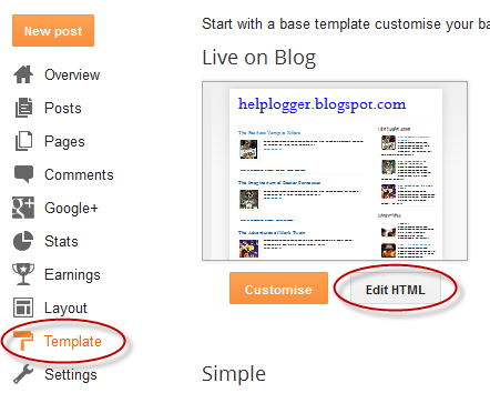
Step 1. Go to Template and click on the Edit HTML button:

Step 2. Click anywhere inside the code area and press the CTRL + F keys to open the Blogger' search box

Step 3. Paste this line inside the search box then hit Enter to find it:
<body expr:class='&quot;loading&quot; + data:blog.mobileClass'>
Note: if you can't find this line, try to find the <body> tag.

Step 4. Just below this line, add the following code:
<span class='item-control blog-admin'>
<style>
.control-panel ul{z-index: 20; position: absolute; margin: 0px auto; background-color: #F6F6F6; width: 100%; }
.control-panel ul li{display: inline-block; float: left; padding: 7px 0px;}
.control-panel ul li a {color:#686868;padding: 7px 15px;border-right: 1px solid #E3E3E3;font-weight: bold;font-size: 13px;}
.control-panel a:hover {text-decoration:none; color:#FC8F44;}
</style>
<div class='control-panel'>
<ul>
<li><a href='http://www.blogger.com/home'>My Blogs</a></li>
<li><a href='http://www.blogger.com/blogger.g?blogID=XXXXXXXXXXXXX#editor/src=sidebar'>New Post</a></li>
<li><a href='http://www.blogger.com/blogger.g?blogID=XXXXXXXXXXXXX#editor/target=page'>New Page</a></li>
<li><a href='http://www.blogger.com/blogger.g?blogID=XXXXXXXXXXXXX#posts'>All Posts</a></li>
<li><a href='http://www.blogger.com/blogger.g?blogID=XXXXXXXXXXXXX#comments'>Comments</a></li>
<li><a href='http://www.blogger.com/blogger.g?blogID=XXXXXXXXXXXXX#pageelements'>Layout</a></li>
<li><a href='http://www.blogger.com/blogger.g?blogID=XXXXXXXXXXXXX#templatehtml'>Edit HTML</a></li>
<li><a href='#' onclick='location.reload(true); return false;'>Refresh</a></li>
<li><a href='/' target='_blank'>New Tab</a></li>
<li><a href='http://www.blogger.com/blogger.g?blogID=XXXXXXXXXXXXX#basicsettings'>Settings</a></li>
<li><a href='http://www.blogger.com/blogger.g?blogID=XXXXXXXXXXXXX#overviewstats'>Stats</a></li>
<li><a href='http://www.blogger.com/logout.g'>Logout</a></li>
</ul>
</div>
</span>
Change XXXXXXXXXXXXX with your unique Blog ID previously copied, and be careful not to delete anything, like quote or any other character.

Step 4. Click on the Save template button to save the changes.

Now take a look at your blog. While you are logged in to Blogger, you should notice your control panel appear on top of your blog. Enjoy!

With this admin control panel for Blogger you can easily access the functions of the blog and you will not have to always open your blog page and the Blogger homepage at the same time.
[Read more]

Vertical drop down menu with jQuery

Posted On // Leave a Comment
jGlideMenu is a vertical menu that can be dragged and dropped so that the reader can place it anywhere, and in addition, he can browse through the tabs in a very peculiar manner that comes with a sliding effect giving a sexy touch.

One of the advantages is that it can store a large number of links and can be removed anytime if we want.

vertical menu, menu for blogger

To understand this menu better and to see it in action, visit this demo blog. There we can drag the menu, navigate through its tabs or close.

To add this vertical menu on your blog, just follow these steps:

1) From your Blogger dashboard, go to Template > Edit HTML and before the </head> tag, add these scripts:
<script src='http://ajax.googleapis.com/ajax/libs/jquery/1.7.1/jquery.min.js' type='text/javascript'/>
<script src='http://ajax.googleapis.com/ajax/libs/jqueryui/1.7.1/jquery-ui.min.js' type='text/javascript'/>
<script src='http://helplogger.googlecode.com/svn/trunk/jQuery.jGlideMenu.min.js' type='text/javascript'/>

<script type='text/javascript'>
//<![CDATA[
$(document).ready(function(){
$('#jGlide_001').jGlideMenu({
tileSource : '.jGlide_001_tiles' ,
demoMode : false
}).show();

$('#switch').click(function(){$(this).jGlideMenuToggle();});
});
//]]>
</script>
2) Now paste before ]]></b:skin> these styles:
.jGM_box {
position: absolute; /* Change absolute with fixed if you want it to float */
top: 50px; /* Distance from above */
right: 760px; /* Distance from right */
width: 227px;
height: 317px;
background: #fff; /* Background color */
margin: 0;
padding: 0;
border: 1px solid #ccc; /* Border */
overflow: hidden;
}
.jGM_header {
position: absolute;
top: 0;
left: 0;
height: 18px;
width: 227px;
background: #d1d1d1; /* Background color for the up bar */
color: #fff;
text-align: right;
vertical-align: middle;
line-height: 18px;
cursor: move;
}
.jGM_header a {
margin-right: 12px;
text-decoration: none;
color: #000 !important;
cursor: pointer;
}
.jGM_wrapper {
position: absolute;
top: 19px;
left: 0;
width: 2270px;
height: 288px;
margin: 0;
padding: 0;
border: 0;
}
.jGM_tile {
position: absolute;
top: 0;
left: 7px;
width: 213px;
height: auto;
overflow: hidden;
margin: 0;
padding: 0;
border: 0;
display: block;
}
.jGM_cats {
width: 100%;
height: 64px;
overflow: hidden;
vertical-align: middle;
text-align: left;
}
.jGM_cats h4 {
font-family: Verdana,Arial,serif;
font-size: 1.8em;
margin: 0;
padding: 2px 0;
line-height: 1.8em;
color: #414141;
font-weight: normal;
}
.jGM_cats p {
font-family: Verdana,tahoma,arial;
font-size: 1em; /* Font size of the description */
margin: 0;
padding: 0;
line-height: 1.2em;
color: #858585; /* Description color */
font-weight: normal;
}
.jGM_pager {
height: 18px;
width: 213px;
line-height: 18px;
margin: 0;
border: 0;
padding: 0;
background: #f6f6f6;
text-align: center;
vertical-align: middle;
}
.jGM_pager a {
text-decoration: none;
font-weight: bold;
text-decoration: none;
display: block;
}
.jGM_pager a:hover { background: #d1d1d1; }
.jGM_pager img { border: 0; margin: 6px 0; }
.jGM_content {
width: 213px;
height: 150px;
margin: 1px 0;
padding: 0;
border: 0;
overflow: hidden;
}
.jGM_content a {
font-family: Tahoma,arial;
text-decoration: none;
color: #333 !important;
height: 18px;
width: 100%;
display: block;
line-height: 18px;
padding: 0 0 0 10px;
background-color: #e6e7e9;
margin: 1px 0;
}
.jGM_content a:hover {
color: #fff !important;
background-color: #4D4E67; /* Bar color on mouseover */
}
.jGM_more {
background-image: url(https://blogger.googleusercontent.com/img/b/R29vZ2xl/AVvXsEhIMyFBsGRH2l8TYWgWepbEhrP2HowQltzA2rrKAgr2D0mrVxw2p-vIE3h5lZon2EXAPi9s4LYJhJ88lC3YeDpWdlg_pvnBVlcNXOTSXbedqdeE43Jjg69v1OiGd_kwhasT9L5-XW_f7PU/s1600/arrow.gif);
background-repeat: no-repeat;
background-position: 203px 50%;
}
.jGM_back {
position: absolute;
top: 255px;
right: 0;
height: 18px;
width: 52px;
background: #d1d1d1;
line-height: 18px;
vertical-align: middle;
text-align: center;
margin: 10px 0 0 0;
padding: 0;
border: 0;
z-index: 99;
}
.jGM_back a {
height: 100%;
width: 100%;
text-decoration: none;
color: #000 !important; /* Color of the "Back" link */
display: block;
}
.jGM_back a:hover {
color: #fff !important; /* Color of the "Back" link on mouseover */
background: #4D4E67;
}
.jGM_reset {
position: absolute;
top: 255px;
right: 62px;
height: 18px;
width: 52px;
background: #d1d1d1;
line-height: 18px;
vertical-align: middle;
text-align: center;
margin: 10px 0 0 0;
padding: 0;
border: 0;
z-index: 99;
}
.jGM_reset a {
height: 100%;
width: 100%;
text-decoration: none;
color: #000 !important; /* Color of the "Home" link */
display: block;
}
.jGM_reset a:hover {
color: #fff !important; /* Color of the "Home" link on mouseover */
background: #4D4E67;
}
3) Now go to Layout and paste the structure of the menu inside a HTML/Javascript gadget:
<div class="jGM_box" id="jGlide_001">

<!-- Here all the links of the first level -->
<ul id="tile_001" class="jGlide_001_tiles" title="Menu" alt="Description of the first level">
<li rel="tile_002">Link 1</li>
<li rel="tile_003">Link 2</li>
<li rel="tile_004">Link 3</li>
<li rel="tile_006">Link 4</li>
<li rel="tile_007">Link 5</li>
<li><a href="URL address">Link 6</a></li>
<li><a href="URL address">Link 7</a></li>
<li><a href="URL address">Link 8</a></li>
<li><a href="URL address">Link 9</a></li>
<li><a href="URL address">Link 10</a></li>
<li><a href="URL address">Link 11</a></li>
</ul>

<!-- Here all the links of the second level -->
<ul id="tile_002" class="jGlide_001_tiles" title="Menu" alt="Description of the second level">
<li rel="tile_005">Link 1.1</li>
<li><a href="URL address">Link 1.2</a></li>
<li><a href="URL address">Link 1.3</a></li>
<li><a href="URL address">Link 1.4</a></li>
</ul>

<ul id="tile_003" class="jGlide_001_tiles" title="Menu" alt="Description of the second level">
<li><a href="URL address">Link 2.1</a></li>
<li rel="tile_008">Link 2.2</li>
<li><a href="URL address">Link 2.3</a></li>
</ul>

<ul id="tile_004" class="jGlide_001_tiles" title="Menu" alt="Description of the second level">
<li><a href="URL address">Link 3.1</a></li>
<li><a href="URL address">Link 3.2</a></li>
<li><a href="URL address">Link 3.3</a></li>
</ul>


<ul id="tile_006" class="jGlide_001_tiles" title="Menu" alt="Description of the second level">
<li><a href="URL address">Link 4.1</a></li>
<li><a href="URL address">Link 4.2</a></li>
<li><a href="URL address">Link 4.3</a></li>
</ul>

<ul id="tile_007" class="jGlide_001_tiles" title="Menu" alt="Description of the second level">
<li><a href="URL address">Link 5.1</a></li>
<li><a href="URL address">Link 5.2</a></li>
</ul>


<!-- Here all the links of the third level -->
<ul id="tile_005" class="jGlide_001_tiles" title="Menu" alt="Description of the third level">
<li><a href="URL address">Link 1.1.1</a></li>
<li><a href="URL address">Link 1.1.2</a></li>
</ul>


<ul id="tile_008" class="jGlide_001_tiles" title="Menu" alt="Description of the third level">
<li><a href="URL address">Link 1.2.1</a></li>
<li><a href="URL address">Link 1.2.2</a></li>
</ul>

</div>
Add the URLs of the links and the names of the tabs and that's it.
If you want to add more links to the first level, then add another line like this:
<li><a href="URL address">Link 12</a></li>
If you want to add another level to the link, then the line should be like this:
<li rel="tile_0010">Link 5</li>
Then in the area of ​​the second or third level, add a piece like this:
<ul id="tile_0010" class="jGlide_001_tiles" title="Menu" alt="Description of the second level">
<li><a href="URL address">Link 5.1</a></li>
<li><a href="Url address">Link 5.2</a></li>
</ul>
Here you should keep something in mind, if you look closely the link takes the REL attribute which must be the same as the ID we put on the second level, these IDs should not repeat and always be unique.
Yes, it sounds complicated, but once you understand the concept, you'll see that is actually pretty simple.
In the area of ​​the styles, there are the parts that can be customized. If you want the menu to be static, let's say you want to add it in the sidebar, then delete the first code of the script that is in italics. And in the CSS styles, remove this part:
position: absolute; /* Change absolute with fixed if you want it to float */
top: 50px; /* Distance above */
right: 760px; /* Distance to the right */
When there are many links then, there will be showing some arrows, so when you mouseover them, it will show the rest of the links either up or down.

Throughout the menu structure we can change the Menu name and the descriptions as well.

As this menu is made with JQuery, it is recommended to verify to have only one version of it.
[Read more]

Horizontal menu with sub-tabs in two columns for Blogger

Posted On // Leave a Comment
This is a very nice horizontal menu in which its sub-tabs are displayed in two columns and is also made with CSS, without any scripts.
blogger navigation menu, css menu, drop-down menu
The "advantage" so to speak, is that the sub-tabs when arranged in two columns are not very long, so it will be neat and less space along. You can see an example here:


Adding A Horizontal Menu With Sub Tabs in Two Columns To Blogger

STEP 1: In Blogger, go to your "Layout" and on the "Page Elements" section.
  • Click on the "Add a Gadget" link just under your header image
  • From the Gadget's List, select "HTML/JavaScript" option.
STEP 2: Simply copy and paste this ENTIRE code into your widget. Note: Leave the "Title" section of this widget blank.
<div id='menucol'>
<div id='topwrapper'>
<ul id='top'>
<li><a href='http://YOUR URL HERE.com'>Tab 1 Title Here</a></li>
<li><a href='http://YOUR URL HERE.com'>Tab 2 Title Here</a></li>
<li><a class='submenucol' href='#'>Tab 3 Title Here</a>
<ul>
<li><a href='http://YOUR URL HERE.com'>Sub Tab 3.1</a></li>
<li><a href='http://YOUR URL HERE.com'>Sub Tab 3.2</a></li>
<li><a href='http://YOUR URL HERE.com'>Sub Tab 3.3</a></li>
<li><a href='http://YOUR URL HERE.com'>Sub Tab 3.4</a></li>
<li><a href='http://YOUR URL HERE.com'>Sub Tab 3.5</a></li>
<li><a href='http://YOUR URL HERE.com'>Sub Tab 3.6</a></li>
</ul>
</li>
<li><a class='submenucol' href='#'>Tab 4 Title Here</a>
<ul>
<li><a href='http://YOUR URL HERE.com'>Sub Tab 4.1</a></li>
<li><a href='http://YOUR URL HERE.com'>Sub Tab 4.2</a></li>
<li><a href='http://YOUR URL HERE.com'>Sub Tab 4.3</a></li>
<li><a href='http://YOUR URL HERE.com'>Sub Tab 4.4</a></li>
<li><a href='http://YOUR URL HERE.com'>Sub Tab 4.5</a></li>
<li><a href='http://YOUR URL HERE.com'>Sub Tab 4.6</a></li>
</ul>
</li>
<li><a class='submenucol' href='#'>Tab 5 Title Here</a>
<ul>
<li><a href='http://YOUR URL HERE.com'>Sub Tab 5.1</a></li>
<li><a href='http://YOUR URL HERE.com'>Sub Tab 5.2</a></li>
<li><a href='http://YOUR URL HERE.com'>Sub Tab 5.3</a></li>
<li><a href='http://YOUR URL HERE.com'>Sub Tab 5.4</a></li>
<li><a href='http://YOUR URL HERE.com'>Sub Tab 5.5</a></li>
<li><a href='http://YOUR URL HERE.com'>Sub Tab 5.6</a></li>
<li><a href='http://YOUR URL HERE.com'>Sub Tab 5.7</a></li>
<li><a href='http://YOUR URL HERE.com'>Sub Tab 5.8</a></li>
</ul>
</li>
<li><a href='http://YOUR URL HERE.com'>Tab 6 Title Here</a></li>

</ul>
<br class='clearit'/>
</div>
</div>
Customize your main tabs by changing the Tab Titles to whatever you want. Include a URL for each one if you want it to be 'clickable'. If not, you can just put a # sign where it says http://YOUR URL HERE.com

You can add or delete as many of the main tabs as you need, just make sure to copy the entire code for the main tab for each additional tab you want:
<li><a href='http://YOUR URL HERE.com'>Tab 7 Title Here</a>
<ul>
<li><a href='http://YOUR URL HERE.com'>Sub Tab 7.1</a></li>
<li><a href='http://YOUR URL HERE.com'>Sub Tab 7.2</a></li>
<li><a href='http://YOUR URL HERE.com'>Sub Tab 7.3</a></li>
</ul>
</li>
STEP 3: Now let's go a step further and add the CSS style in our Template
  • Go to Template > Edit HTML
  • Click on the sideways arrow next to <b:skin>...</b:skin> 

  • Then click anywhere inside the code area and search - using CTRL + F keys - for the ]]></b:skin> tag and just above ]]></b:skin> add this code:
/* Horizontal menu with 2 columns
----------------------------------------------- */
#menucol {
width:940px;
height:37px;
background-image: -moz-linear-gradient(top, #666666, #000000);
background-image: -webkit-gradient(linear, left top, left bottom, color-stop(0.00, #666666), color-stop(1.0, #000000));
filter: progid:DXImageTransform.Microsoft.Gradient(gradientType=0,startColorStr=#666666,endColorStr=#000000);
border-bottom:1px solid #666666;
border-top:1px solid #666666;
margin:0 auto;padding:0 auto;
overflow:hidden;
}
#topwrapper {
width:940px;
height:40px;
margin:0 auto;
padding:0 auto;
}
.clearit {
clear: both;
height: 0;
line-height: 0.0;
font-size: 0;
}
#top {
width:100%;
}
#top, #top ul {
padding: 0;
margin: 0;
list-style: none;
}
#top a {
border-right:1px solid #333333;
text-align:left;
display: block;
text-decoration: none;
padding:10px 12px 11px;
font:bold 14px Arial;
text-transform:none;
color:#eee;
}
#top a:hover {
background:#000000;
color:#F6F6F6;
}
#top a.submenucol {
background-image: url(https://blogger.googleusercontent.com/img/b/R29vZ2xl/AVvXsEjiFtN0ntQAwaii2hREP1F1juitG2knSeqgq8pNkvpPIy0gxVlwvTv406uAYdqkEsShBMc7Iq24h4e8Tpr7H_mhBDPf1TGihPRDHI5qdNKRat-vbN47yPKrZ5aIHWE0MBm1qotZM6dqMuc/s1600/arrow_white.gif);
background-repeat: no-repeat;
padding: 10px 24px 11px 12px;
background-position: right center;
}
#top li {
float: left;
position: relative;
}
#top li {
position: static !important;
width: auto;
}
#top li ul, #top ul li {
width:300px;
}
#top ul li a {
text-align:left;
padding: 6px 15px;
font-size:13px;
font-weight:normal;
text-transform:none;
font-family:Arial, sans-serif;
border:none;
}
#top li ul {
z-index:100;
position: absolute;
display: none;
background-color:#F1F1F1;
margin-left:-80px;
padding:10px 0;
border-radius: 0px 0px 6px 6px;
box-shadow:0 2px 2px rgba(0,0,0,0.6);
filter:alpha(opacity=87);
opacity:.87;
}
#top li ul li {
width:150px;
float:left;
margin:0;
padding:0;
}
#top li:hover ul, #top li.hvr ul {
display: block;
}
#top li:hover ul a, #top li.hvr ul a {
color:#333;
background-color:transparent;
text-decoration:none;
}
#top ul a:hover {
text-decoration:underline!important;
color:#444444 !important;
}
  • Now find (CTRL + F) this line:
/* Tabs
  • It will also have some little lines beneath:
/* Tabs
----------------------------------------------- */
  • And just below these little lines, delete the code below until you reach at:
/* Columns
----------------------------------------------- */
  • Instead of the code that you have removed, add this one:
#crosscol ul {z-index: 200; padding:0 !important;}
#crosscol li:hover {position:relative;}
#crosscol ul li {padding:0 !important;}
.tabs-outer {z-index:1;}
.tabs-inner {padding: 0 0px;}
See this screenshot for more info:
menu for blogger, blogger gadgets, blogger widgets
STEP 4: The final step is to Save the Template and you are done!

Visit your blog to see a beautiful navigation menu just below header.
If you have any questions or need help, leave a comment below.
[Read more]

Create Horizontal Navigation Menu With Drop Down Submenus Using CSS

Posted On // Leave a Comment
The following drop down menu is made only with CSS, is a horizontal menu with sub-tabs and the right side has a rounded search. A menu is handy for those who do not require complex menus or prefer not to use one that requires scripts and/or too many images, also the installation and customization is quite simple, and to top it off is quite functional.
To see this drop down menu in action, visit this demo blog

blogger menu, drop down menu, css menu

Prior to doing anything, if you are using a Template made through Blogger Template Designer, then you should consider doing these changes in the template, otherwise the menu might not be displayed correctly:

From your Blogger's Dashboard, go to Template (make a backup < see the screenshot) > Edit HTML:


and search (CTRL + F) for the following line:

<b:section class='tabs' id='crosscol' maxwidgets='1' showaddelement='yes'>

Screenshot

Remove the code in red.
You may have many parts as the one in red, delete all you find.

....then find this section in your template:
/* Tabs
----------------------------------------------- */

...and remove all that is within it, until you reach to the Headings part.

/* Tabs
----------------------------------------------- */
.tabs-outer {
overflow: hidden;
position: relative;
background: $(tabs.background.color) $(tabs.background.gradient) repeat scroll 0 0;
}

#layout .tabs-outer {
overflow: visible;
}

.tabs-cap-top, .tabs-cap-bottom {
position: absolute;
width: 100%;

border-top: 1px solid $(tabs.border.color);

}

.tabs-cap-bottom {
bottom: 0;
}

.tabs-inner .widget li a {
display: inline-block;

margin: 0;
padding: .6em 1.5em;

font: $(tabs.font);
color: $(tabs.text.color);

border-top: 1px solid $(tabs.border.color);
border-bottom: 1px solid $(tabs.border.color);
border-$startSide: 1px solid $(tabs.border.color);
}

.tabs-inner .widget li:last-child a {
border-$endSide: 1px solid $(tabs.border.color);
}

.tabs-inner .widget li.selected a, .tabs-inner .widget li a:hover {
background: $(tabs.selected.background.color) $(tabs.background.gradient) repeat-x scroll 0 -100px;
color: $(tabs.selected.text.color);
}

/* Headings
----------------------------------------------- */

Then add this to where the code has been removed (instead of the code in green):
#crosscol ul {z-index: 200; padding:0 !important;}
#crosscol li:hover {position:relative;}
#crosscol ul li {padding:0 !important;}
.tabs-outer {z-index:1;}
.tabs .widget ul, .tabs .widget ul {overflow: visible;}
Having done this, we can finally add our menu.

How To Add Horizontal Drop Down Menu to Blogger

To put this horizontal menu with submenus in your blog, then follow the next steps:

Step 1. From Template, go to Edit HTML and just above ]]></b:skin> paste these styles:
/* Horizontal drop down menu
----------------------------------------------- */
#menuWrapper {
width:100%; /* Menu width */
height:35px;
padding-left:14px;
background:#333; /* Background color */
border-radius: 10px; 
}
.menu {
padding:0;
margin:0;
list-style:none;
height:35px;
position:relative;
z-index:5;
font-family:arial, verdana, sans-serif;
}
.menu li:hover li a {
background:none;
}
.menu li.top {display:block; float:left;}
.menu li a.top_link {
display:block;
float:left;
height:35px;
line-height:34px;
color:#ccc;
text-decoration:none;
font-family:"Verdana", sans-serif;
font-size:12px; /* Font size */
font-weight:bold;
padding:0 0 0 12px;
cursor:pointer;
}
.menu li a.top_link span {
float:left;
display:block;
padding:0 24px 0 12px;
height:35px;
}
.menu li a.top_link span.down {
float:left;
display:block;
padding:0 24px 0 12px;
height:35px;
}
.menu li a.top_link:hover, .menu li:hover > a.top_link {color:#fff; }
.menu li:hover {position:relative; z-index:2;}
.menu ul,
.menu li:hover ul ul,
.menu li:hover ul li:hover ul ul,
.menu li:hover ul li:hover ul li:hover ul ul,
.menu li:hover ul li:hover ul li:hover ul li:hover ul ul
{position:absolute; left:-9999px; top:-9999px; width:0; height:0; margin:0; padding:0; list-style:none;}

.menu li:hover ul.sub {
left:0;
top:35px;
background:#333; /* Submenu background color */
padding:3px;
white-space:nowrap;
width:200px;
height:auto;
z-index:3;
}
.menu li:hover ul.sub li {
display:block;
height:30px;
position:relative;
float:left;
width:200px;
font-weight:normal;
}
.menu li:hover ul.sub li a{
display:block;
height:30px;
width:200px;
line-height:30px;
text-indent:5px;
color:#ccc;
text-decoration:none;
}
.menu li ul.sub li a.fly {
/* Submenu Background Color */
background:#333 url(https://blogger.googleusercontent.com/img/b/R29vZ2xl/AVvXsEi-65D-ceP2AZgEmUhORWZx3EBX1TqVHY6gk61u05xxa8UmMeJbTQ5B9k0AaBoc84p9U1joRdEtBTGfZobSnu6NGuXQInvHhIT_WPdVTjKGdK9-lg7dOY6_1IpO0dpDlT_mEIILm6vaZYg/s1600/arrow_over.gif) 185px 10px no-repeat;}
.menu li:hover ul.sub li a:hover {
background:#515151; /* Background Color on mouseover */
color:#fff;
}
.menu li:hover ul.sub li a.fly:hover, .menu li:hover ul li:hover > a.fly {
/* Background on Mouseover */
background:#646464 url(https://blogger.googleusercontent.com/img/b/R29vZ2xl/AVvXsEi-65D-ceP2AZgEmUhORWZx3EBX1TqVHY6gk61u05xxa8UmMeJbTQ5B9k0AaBoc84p9U1joRdEtBTGfZobSnu6NGuXQInvHhIT_WPdVTjKGdK9-lg7dOY6_1IpO0dpDlT_mEIILm6vaZYg/s1600/arrow_over.gif) 185px 10px no-repeat; color:#fff;}

.menu li:hover ul li:hover ul,
.menu li:hover ul li:hover ul li:hover ul,
.menu li:hover ul li:hover ul li:hover ul li:hover ul,
.menu li:hover ul li:hover ul li:hover ul li:hover ul li:hover ul {
left:200px;
top:-4px;
background: #333; /* Background Color of the Submenu */
padding:3px;
white-space:nowrap;
width:200px;
z-index:4;
height:auto;
}
#search {
width: 228px; /* Width of the Search Box */
height: 50px;
float: right;
z-index: 2;
text-align: center;
margin-top: 5px;
margin-right: 6px;
/* Background of the Search Box */
background: url(https://blogger.googleusercontent.com/img/b/R29vZ2xl/AVvXsEhzSRt8GbG6Oox-y2g38_eyjGOKa2OwT75RpITXbLBOi7ngAh-Zk3jWDQomAwZWjpVe9v6nl3G1YD9IJBt6d2WJpNaRvvijhXCGl6f5c5pFVa-T2VYnz_7t1Gyeo36t_-gfe0pgzpQDElo/s1600/searchBar1.png) no-repeat;
}
#search-box {
margin-top: 3px;
border:0px;
background: transparent;
text-align:center;
}


Screenshot
Step 2. Save the Template


Step 3. Go to Layout > click on Add a Gadget link


Step 4. Choose HTML/Javascript and paste the following inside the empty box:

<div id='menuWrapper'>
<ul class='menu'>
<li class='top'><a class='top_link' href='Link URL'><span>Title 1</span></a></li>

<li class='top'><a class='top_link' href='Link URL'><span class='down'>Title 2</span></a><ul class='sub'><li><a class='fly' href='Link URL'>Submenu 2.1</a><ul>
<li><a href='Link URL'>Submenu 2.1.1</a></li>
<li><a href='Link URL'>Submenu 2.1.2</a></li>
<li><a href='Link URL'>Submenu 2.1.3</a></li>
</ul>
</li>
<li class='mid'><a class='fly' href='Link URL'>Submenu 2.2</a>
<ul>
<li><a href='Link URL'>Submenu 2.2.1</a></li>
<li><a href='Link URL'>Submenu 2.2.2</a></li>
<li><a href='Link URL'>Submenu 2.2.3</a></li>
<li><a class='fly' href='Link URL'>Submenu 2.2.4</a>
<ul>
<li><a href='Link URL'>Submenu 2.2.4.1</a></li>
<li><a href='Link URL'>Submenu 2.2.4.2</a></li>
<li><a href='Link URL'>Submenu 2.2.4.3</a></li>
</ul>
</li>
<li><a href='Link URL'>Submenu 2.2.5</a></li>
<li><a class='fly' href='Link URL'>Submenu 2.2.6</a>
<ul>
<li><a href='Link URL'>Submenu 2.2.6.1</a></li>
<li><a href='Link URL'>Submenu 2.2.6.2</a></li>
</ul>
</li>
</ul>
</li>
<li><a href='Link URL'>Submenu 2.3</a></li>
<li><a href='Link URL'>Submenu 2.4</a></li>
<li><a href='Link URL'>Submenu 2.5</a></li>
</ul>
</li>

<li class='top'><a class='top_link' href='Link URL'><span class='down'>Title 3</span></a>
<ul class='sub'>
<li><a href='Link URL'>Submenu 3.1</a></li>
<li><a href='Link URL'>Submenu 3.2</a></li>
<li><a href='Link URL'>Submenu 3.3</a></li>
<li><a href='Link URL'>Submenu 3.4</a></li>
</ul>
</li>

<li class='top'><a class='top_link' href='Link URL'><span class='down'>Title 4</span></a>
<ul class='sub'>
<li><a href='Link URL'>Submenu 4.1</a></li>
<li><a class='fly' href='Link URL'>Submenu 4.2</a>
<ul>
<li><a href='Link URL'>Submenu 4.2.1</a></li>
<li><a href='Link URL'>Submenu 4.2.2</a></li>
<li><a href='Link URL'>Submenu 4.2.3</a></li>
<li><a href='Link URL'>Submenu 4.2.4</a></li>
<li><a href='Link URL'>Submenu 4.2.5</a></li>
<li><a href='Link URL'>Submenu 4.2.6</a></li>
</ul>
</li>
<li><a href='Link URL'>Submenu 4.3</a></li>
<li><a href='Link URL'>Submenu 4.4</a></li>
<li><a href='Link URL'>Submenu 4.5</a></li>
<li><a href='Link URL'>Submenu 4.6</a></li>
</ul>
</li>

<li class='top'><a class='top_link' href='Link URL'><span class='down'>Title 5</span></a>
<ul class='sub'>
<li><a href='Link URL'>Submenu 5.1</a></li>
<li><a href='Link URL'>Submenu 5.2</a></li>
<li><a href='Link URL'>Submenu 5.3</a></li>
</ul>
</li>


<!-- Search Bar -->
<li>
<form action='/search' id='search' method='get' name='searchForm' style='display:inline;'>
<input id='search-box' name='q' onblur='if (this.value == &quot;&quot;) this.value = &quot;Search here...&quot;;' onfocus='if (this.value == &quot;Search here...&quot;) this.value = &quot;&quot;;' size='28' type='text' value='Search here...'/></form>
</li>

</ul>
</div>

Customization:

- replace the text in blue and red with your links and titles.
- if you need more tabs, then add a line like this just above <!-- Search Bar -->

<li class="top"><a href="Link URL" class="top_link"><span>Title</span></a></li>

- if you want to add a tab with sub-tabs, then add this code:

<li class="top"><a href="Link URL" class="top_link"><span class="down">Title</span></a>
<ul class="sub">
<li><a href="Link URL">Submenu Title</a></li>
</ul>
</li>

- and if you want one of the other sub-tabs have sub-tabs then remove a line like the one in orange and change it to a code like this:

<li><a href="Link URL" class="fly">Submenu Title</a>
<ul>
<li><a href="Link URL">Other Submenu</a></li>
</ul>
</li>

And that's it! Now Save your Widget and enjoy your new drop down menu! ;)
[Read more]

A Beautiful jQuery Drop-Down Menu For Blogger Blogspot

Posted On // Leave a Comment
Alright, this time, we are going to make a stylish and simple jQuery drop down menu. The main objective is to make it as simple as possible, with some little jQuery effect and easy to customize/ apply different style on it. To style it into your own design, you just have to modify the a tag CSS style. You can change colors or put background images, or the size and color of text.
jquery menu, menu blogger

Steps Adding the jQuery Drop-Down menu

Step 1. Go to Dashboard - Template - Edit HTML - Proceed


Step 2. Expand Widget Template (make a backup)
    jquery drop-dowm menu


    Step 3. Search for the following code:

    ]]></b:skin>

    Step 4. Add the following CSS code before/above it:

    #jsddm {
    height: 40px;
    margin: 0;
    overflow: visible;
    z-index: 2;
    padding: 15px;
    position:relative;
    }
    #jsddm li {
    float: left;
    list-style: none;
    font: 12px Tahoma, Arial;
    }
    #jsddm li a {
    display: block;
    white-space: nowrap;
    margin:1px 3px;
    border: 1px solid #AAAAAA;
    background: #cccccc;
    background: -webkit-gradient(linear, left top, left bottom, from(#ebebeb), to(#cccccc));
    background: -moz-linear-gradient(top, #ebebeb, #cccccc);
    padding: 5px 10px;
    -webkit-border-radius: 5px;
    -moz-border-radius: 5px;
    border-radius: 5px;
    text-shadow: #ffffff 0 1px 0;
    color: #363636;
    font-size: 15px;
    font-family: Helvetica, Arial, Sans-Serif;
    text-decoration: none;
    vertical-align: middle;
    }
    #jsddm li a:hover {
    background: #C8C8C8;
    }
    #jsddm li ul {
    margin: 0;
    padding: 0;
    position: absolute;
    visibility: hidden;
    border-top: 1px solid white;
    }
    #jsddm li ul li {
    float: none;
    display: inline;
    }
    #jsddm li ul li a {
    width: auto;
    background: #CAE8FA;
    }
    #jsddm li ul li a:hover {
    background: #A3CEE5;
    }

    Step 5. Now find this piece of code:

    </head>

    Step 6. Add this code immediately before/ABOVE it:

    <script src='http://ajax.googleapis.com/ajax/libs/jquery/1.2.6/jquery.js' type='text/javascript'/>
      <script type='text/javascript'>
      //<![CDATA[
    var timeout    = 500;
      var closetimer = 0;
      var ddmenuitem = 0;
    function jsddm_open()
      {  jsddm_canceltimer();
      jsddm_close();
      ddmenuitem = $(this).find('ul').css('visibility', 'visible');}
    function jsddm_close()
      {  if(ddmenuitem) ddmenuitem.css('visibility', 'hidden');}
    function jsddm_timer()
      {  closetimer = window.setTimeout(jsddm_close, timeout);}
    function jsddm_canceltimer()
      {  if(closetimer)
      {  window.clearTimeout(closetimer);
      closetimer = null;}}
    $(document).ready(function()
      {  $('#jsddm > li').bind('mouseover', jsddm_open)
      $('#jsddm > li').bind('mouseout',  jsddm_timer)});
    document.onclick = jsddm_close;
      //]]>
      </script>

    Step 7. Click on Save Template button.

    Step 8. Go to Layout > click on "Add a gadget" link


    Step 9. Choose HTML/JavaScript from the pop-up window


    Step 10. Paste the following code in the empty box:

    <ul id="jsddm">
      <li><a href="#">Home</a>
      <li><a href="#">Link 1</a>
      <ul>
      <li><a href="#">Drop 1-1</a></li>
      <li><a href="#">Drop 1-2</a></li>
      <li><a href="#">Drop 1-3</a></li>
      </ul>
      </li>
     <li><a href="#">Link 2</a>
      <ul>
      <li><a href="#">Drop 2-1</a></li>
      <li><a href="#">Drop 2-2</a></li>
      </ul>
      </li>
     <li><a href="#">Link 3</a>
      <ul>
      <li><a href="#">Drop 3-1</a></li>
      <li><a href="#">Drop 3-2</a></li>
      <li><a href="#">Drop 3-3</a></li>
      <li><a href="#">Drop 3-4</a></li>
      </ul>
      </li>
     <li><a href="#">Link 4</a></li>
      <li><a href="#">Link 5</a></li>
      <li><a href="#">Link 6</a></li>
      </li></ul>

    Note :

    You must change links titles and replace the # symbol with the URL address of each of your links

    Step 11. Click on Save

    Important:

    - if your menu is on the sidebar, or footer, just drag it to your page header and click and click Save again.
    - if drop down links are not showing, do the following:

    Go back to Template > Edit HTML and search (CTRL + F) for this code:

    <b:section class='header' id='header' maxwidgets='1' showaddelement='no'>

    You should change 1 with 3 and no with yes like this:

    <b:section class='header' id='header' maxwidgets='3' showaddelement='yes'>
    Save the Template.

    Next thing to do is to go to Layout and drag your menu immediately below your header


    Then click on Save Arrangement


    Here you can see the DEMO.

    Enjoy! :)
    [Read more]

    Add Css/Jquery fixed horizontal menu to blogger blog

    Posted On // Leave a Comment
    This navigation bar gets semi-transparent when you scroll down the page and is slightly showing up by fading out and becoming almost transparent. When the user hovers over it, the menu becomes opaque again.

    Inside of the navigation there are some links, a search input and a top and bottom button that allows the user to navigate to the top or bottom of the page.


    Let's start adding it...

    1. Go To Blogger - Template - Edit HTML


     ....and select the "expand widget templated" box:


    2. Search (using CTRL + F) for this piece of code:

    </head> 

    3. Just above/before the </head> tag, add this code:

    <link rel="stylesheet" href="http://helplogger.googlecode.com/svn/trunk/html/[helplogger.blogspot.com]Fixed Fade Out Menu.css"/>
    <script type="text/javascript" src="http://helplogger.googlecode.com/svn/trunk/html/[helplogger.blogspot.com]jquery-1.3.2.js"></script>
     <script type="text/javascript">
                $(function() {
                    $(window).scroll(function(){
                        var scrollTop = $(window).scrollTop();
                        if(scrollTop != 0)
                            $('#nav').stop().animate({'opacity':'0.2'},400);
                        else   
                            $('#nav').stop().animate({'opacity':'1'},400);
                    });
                   
                    $('#nav').hover(
                        function (e) {
                            var scrollTop = $(window).scrollTop();
                            if(scrollTop != 0){
                                $('#nav').stop().animate({'opacity':'1'},400);
                            }
                        },
                        function (e) {
                            var scrollTop = $(window).scrollTop();
                            if(scrollTop != 0){
                                $('#nav').stop().animate({'opacity':'0.2'},400);
                            }
                        }
                    );
                });
            </script>

    4) Now search for this tag:

    <body>  

    If you can't find it, search for this one:

    <body expr:class='&quot;loading&quot; + data:blog.mobileClass'>

    5) Just below/after this code, copy and paste the following code:

    <div id="nav">
    <ul>
    <li><a class="top" href="#top"><span></span></a></li>
    <li><a class="bottom" href="#bottom"><span></span></a></li>
    <li><a href='URL address'><span>Link 1</span></a></li>
    <li><a href='URL address'><span>Link 2</span></a></li>
    <li><a href='URL address'><span>Link 3</span></a></li>
    <li><a href='URL address'><span>Link 4</span></a></li>
    <li><a href='URL address'><span>Link 5</span></a></li>
    <li><a href='URL address'><span>Link 6</span></a></li><li class="search">

    <input type="text"/><input class="searchbutton" type="submit" value=""/>
    </li>
    </ul>
    </div>
    <div id="top"></div>
    <div class="desc"></div>
    <div id="bottom"></div>
    <div class="scroll"></div>

    Note: Replace URL address with the URL of your pages and Link 1, 2, 3, 4, 5, 6 with the name of the link that will appear in the menu.

    6) Now click on the Save Template button and you're done ;)
    Credit goes to the original author. This widget was inspired by David Walsh’s top navigation bar.
    [Read more]
    Click to go to top
